Have a Spooky Cute Birthday!


Hello crafty friends! My name is Peggy Emmerink and welcome to my Heffy Doodle blog series called Color Wheel Combos! I usually choose the colors for my card either intuitively or get inspiration from fellow crafters. But for this series, I wanted to get up close and personal with color by using a color wheel to help me choose colors that work well together. I hope to learn a lot for myself along the way. But I certainly hope you will enjoy going on this journey of discovery with me! Let’s get started!
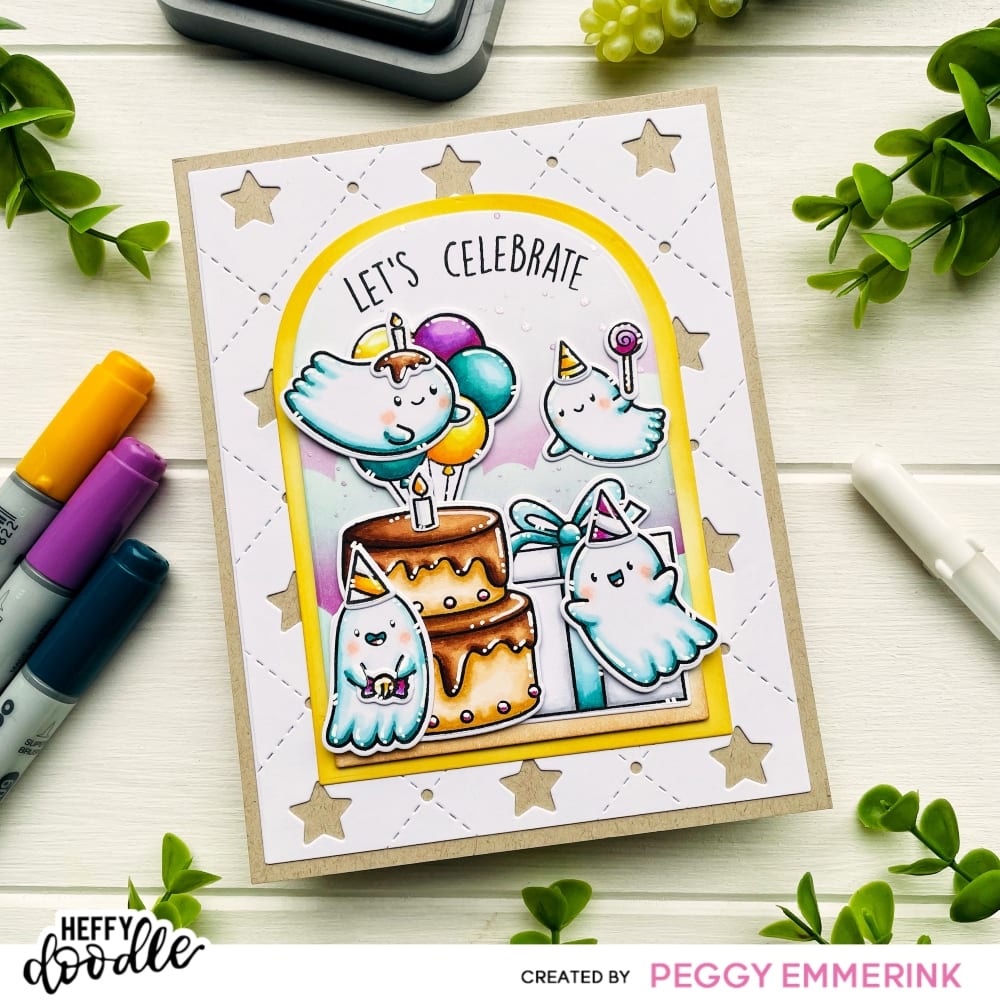
Last week was my little one’s birthday and he turned 5! He looked forward to it for such a long time and had a blast. Of course, such a joyous occasion has to be accompanied by a personalised card. This is one of the things I love about cardmaking the most. You can make something special and tailored to what a person likes. My son absolutely adores Halloween (although it isn’t really celebrated in the Netherlands) and therefore I wanted to create a spooky cute birthday card for him.
I knew that I wanted to stay away from the traditional Halloween color scheme. So what to choose?! For this card I decided to go for a color triad. Triadic colors are sets of three colors that are equally spaced from each other on the color wheel. When placed side by side, a set of triadic colors creates a bold contrast. I decided upon using blue-greens for the ghosts I wanted on my card. Following the color triad, this meant adding yellow-oranges and red-violets into the mix.

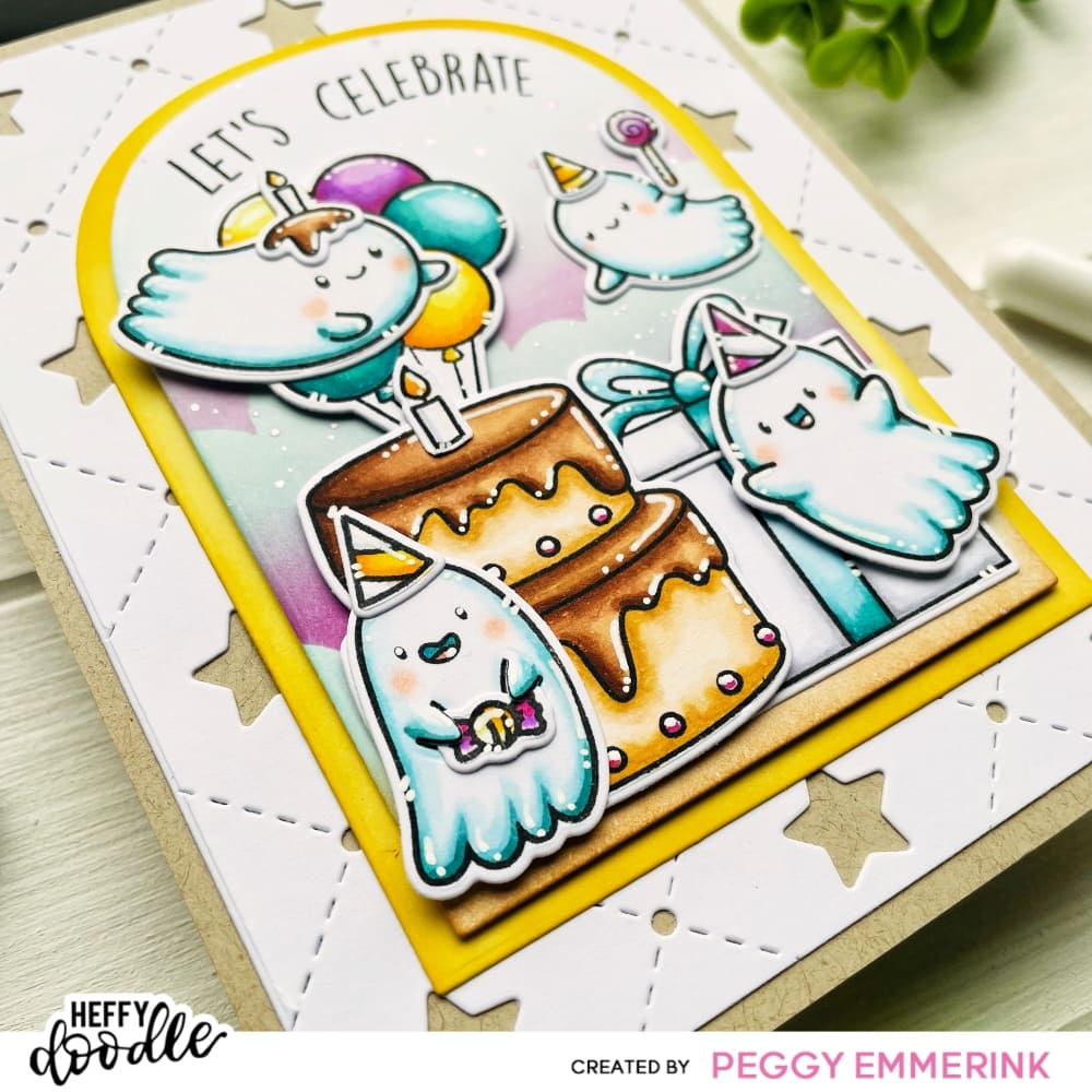
I started by stamping out the ghosts and some of the accessories from the Ghoulfriends stamp set. I stamped the birthday images; the cake, balloons, party hats and large gift from the Popping By stamp set. I stamped with alcohol marker friendly ink on alcohol marker friendly cardstock. I colored with my BG10, RV17/V06 and Y10 series copic markers to match the color triad. I also used some ‘white’ using cool grey markers and browns for the chocolate cake (E30 series). I added white accents using a gel pen and cut the images using the coordinating dies.

I made the base of the card (4 1/4 x 5 1/2 inch) from some kraft cardstock. I cut the Carnival Backdrop from some white cardstock and cut it down using a slightly smaller Skinny Imperial Rectangle Die (which I love and are retiring and are still available in the Heffy Doodle Vault at a big discount!). For the panels on top the Cathedral Window Dies would have been perfect, but I don’t own them. So I substituted with a different die set. The yellow frame was colored with Distress Oxide Fossilized Amber. For the scene panel I used Distress Tea Dye Ink (ground), Salvaged Patina, Seedless Preserves and Milled Lavender Distress Oxides for the sky. I created the clouds with the Cloudy Skies stencil. I adhered everything with a combination of liquid glue and foam tape and finished with a sentiment from the Popping By stamp set (I used a stamping tool to position it in an arched manner).

Using a triadic color scheme can be quite rewarding. It is often used in, for example, interior design, but is also useful for photography. Any time you use triadic colors in a project, it is best to keep them balanced. Choose one of the three colors as the main color on your card, and use the others as accent colors. Another tip is to vary the saturation of the color. I didn’t do this for today’s card. As this was a children’s birthday card I really wanted it to pop. But I’ll be sure to play around with triadic colors and color saturation in a future project! Hope you liked my card and I wish you a crafty day!
Long distance hugs,
Peggy
(Come say hi on Instagram)

Floriane
May 3, 2023 at 6:49 pmI love the result!