Sending Smiles and Happy Mail!


Hello crafty friends! My name is Peggy Emmerink and welcome to my Heffy Doodle blog series called Color Wheel Combos! I usually choose the colors for my card either intuitively or get inspiration from fellow crafters. But for this series, I wanted to get up close and personal with color by using a color wheel to help me choose colors that work well together. I hope to learn a lot for myself along the way. But I certainly hope you will enjoy going on this journey of discovery with me! Let’s get started!
I always enjoy seeing cards that have a happy mail theme and what many of them have in common is the color scheme: Red and Blue. Red and blue are two of the three primary colors (the third is yellow), which are the most pure colors. This means that by mixing these three colors, we are able to obtain all other colors (not counting shades, tints and tones, which are obtained by adding black, white or gray). The contrast that primary colors form is the most basic of seven types of contrast, called Contrast of Hue.

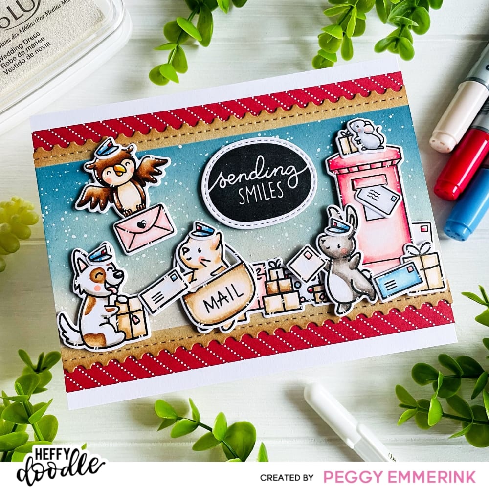
Let’s check out this contrast on the card I made today! I started by cutting a card base with a front panel measuring 4 1/4 x 5 1/2 inch. I am using it in a landscape format. I took out my Slimline Mini Mail dies and cut a slimline panel from some kraft cardstock. I thought the serrated edges would go well with the mail theme. I cut the left and right side off to obtain a panel 5 1/2 inch in width.
To create a fun layer between the slimline panel and the card base I cut a panel measuring 3 3/4 x 5 1/2 inch from the red pattern in The Greatest Show patterned paper pack. Before adhering the layers together, I used some Heffy Doodle memo tape to mask off the serrated edge on the kraft panel. I blended a dark blue, a lighter blue and a white pigment ink from top to bottom and splattered the panel with some white acrylic paint for some interest.
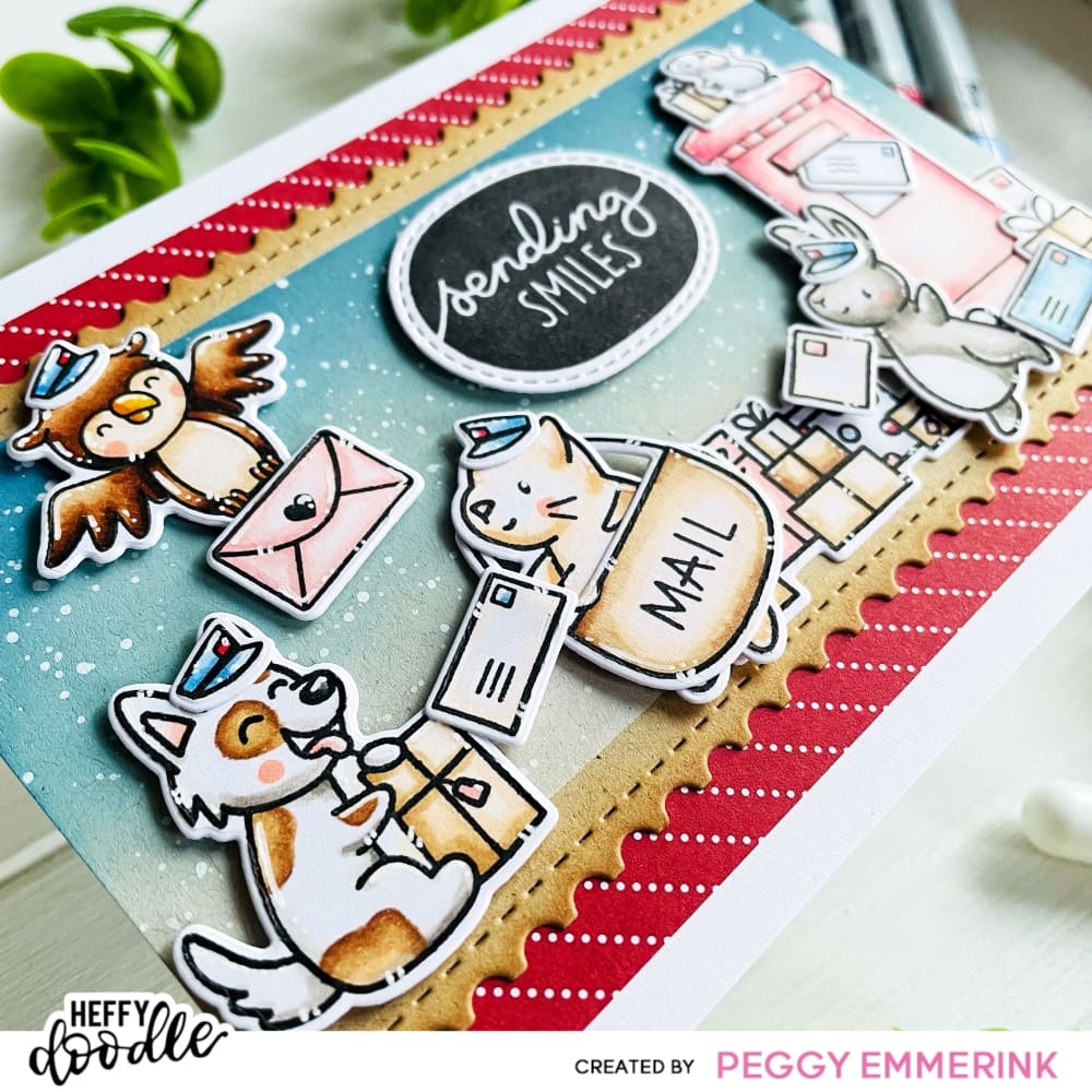
I combined many different stamp sets to mix and match and create a fun mail room with all sorts of critters in it. The main images are from the Wrapped with Love and Special Delivery stamp set. But I also used elements from the Yappy Happy Mail, Deer to Me, and Hootiful stamp sets. I stamped in an alcohol marker friendly ink on suitable cardstock and colored everything with my alcohol markers.
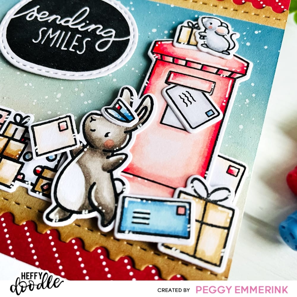
Of course I used some bright reds and blues, but I also chose a more washed out tint of red which looks pinkish in comparison. This is actually my most used pink combination on all my cards (copic markers R20, R11, R00, R000). Finally, I stamped out the Pebble Sentiments ‘Sending Smiles’ in black ink and cut it with the coördinating dies.

Before I wave goodbye, and since I’m a nerd who did a deep dive into why the color scheme of red and blue is so common, I wanted to tell you some fun facts about this color scheme. One answer to the question why red and blue is such a common color scheme is simply because they are primary colors. They create an easy contrast which draws our attention easily. And this is probably also a reason why these colors are so common in our everyday life. For example in our national flags. Of the 192 independent national flags in the world, 30 use the color scheme of red, white and blue. This seems to be because these colors have historically been the easiest to obtain to dye our fabrics. Fascinating!
I hope you liked my post and my card! Bye for now!
Long distance hugs,
Peggy
(Come say hi on Instagram!)

Marjolein
April 19, 2023 at 3:21 pmWhat a fun post! I love reading this and I will for sure use my color wheel soon too for my cards. Great idea and thanks for the inspiration.
Love,
Marjolein
Anonymous
April 23, 2023 at 12:09 amHi